Visualizing Speech

Project Overview
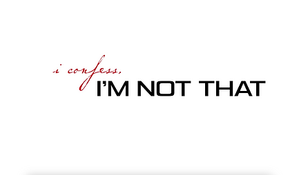
title: Revolving Door Lyric Video
Words as visuals
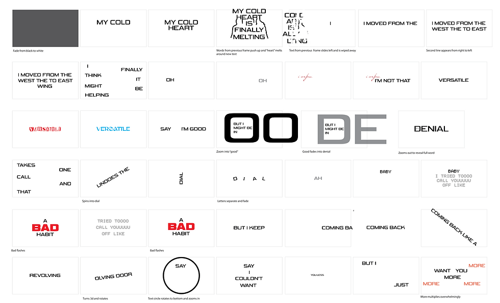
The mission for this project was to transform spoken language into a visual experience through typography and animation. By combining type design, movement, and timing, the motion graphics work with the audio to emphasize the tone, emotion, and meaning of the song. The final outcome was mean't to be a 30 second to one minute video created entirely with typography, color, and motion, without the use of illustrations or images.
The challenge
One of the main challenges of this project is communicating emotion, tone, and meaning using only typography, color, and motion without relying on images or illustrations. The text must stay visually engaging while remaining readable and in synch with the audio. Balancing timing, movement, and composition to effectively match the pace and feeling of the speech can be difficult. Furthermore, this was my first complex project using After Effects, so there were many tools and techniques I had to explore for the first time. However, this was a challenge I was eager to face and figure out.
Process

Choosing a subject
The audio I chose is the first verse, pre-chorus, chorus, and post-chorus of Revolving Door by Tate Mcrae. This song caters to an audience that feels like they can’t stop going back to someone. Its purpose is to feel relatable to
listeners and as a way for the artist to vent. This fragment of the audio includes the whole message of the song, and the repetitive words emphasize the idea of being stuck in a cycle, which I wanted to focus on in my visuals. To do this, I planned to have the text repeat, multiply, and move back and forth on the screen. Furthermore, I chose a typeface that resembles the one used in Tate Mcrae's tour visuals, and a color palette that compliments the music video for the song.
inspiration: Music video and tour visuals

storyboard: Created on Adobe Illustrator
Primary typeface:

color palette:


Revisions
After presenting the first draft of the project and receiving feedback, I went back in and made some adjustments. Transitions were made smoother and alignment/composition issues were fixed.
Reflection
A better understanding of AE
After completing this project, I felt a lot more comfortable with After Effects, and gained a deeper understanding of how to express meaning with typography rather than a more direct approach with illustrations. This challenge pushed me to think harder, and I was able to convey the themes of repeated cycles and losing control in the way the type moved and appeared.


