Natures love

Project Overview
Rebranding with love
In the heart of Waterbury, Connecticut sits a juice bar called Natures Love Juice. In addition to juice, they sell smoothies, shakes, bagels, and even beef patties. For a graphic design class, I was given the opportunity to re-imagine the Natures Love Juice branding.
The challenge
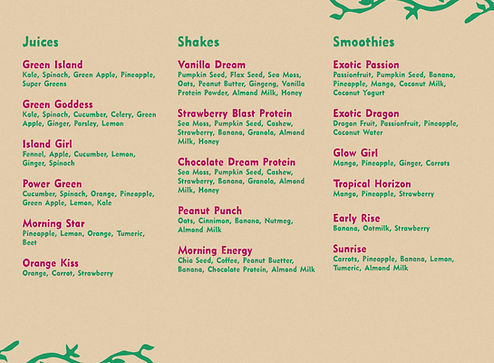
Natures Love has a strong interest in, well, nature. If you go into their shop, you'll find plants scattered all over the room. They have made an attempt to incorporate their love of nature into their brand, but struggled with the execution, some examples being their virus infested website or busy menu. My challenge was to recreate their brand to be more user friendly and clean, while still keeping the nods to nature.

What I did
- Logo
- Color Palette
- Typography
- Website
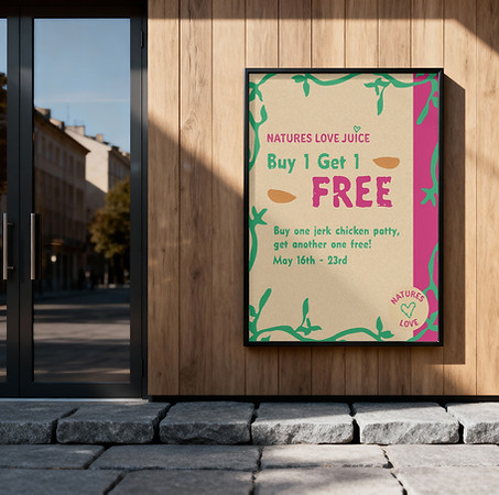
- Packaging/Advertisement
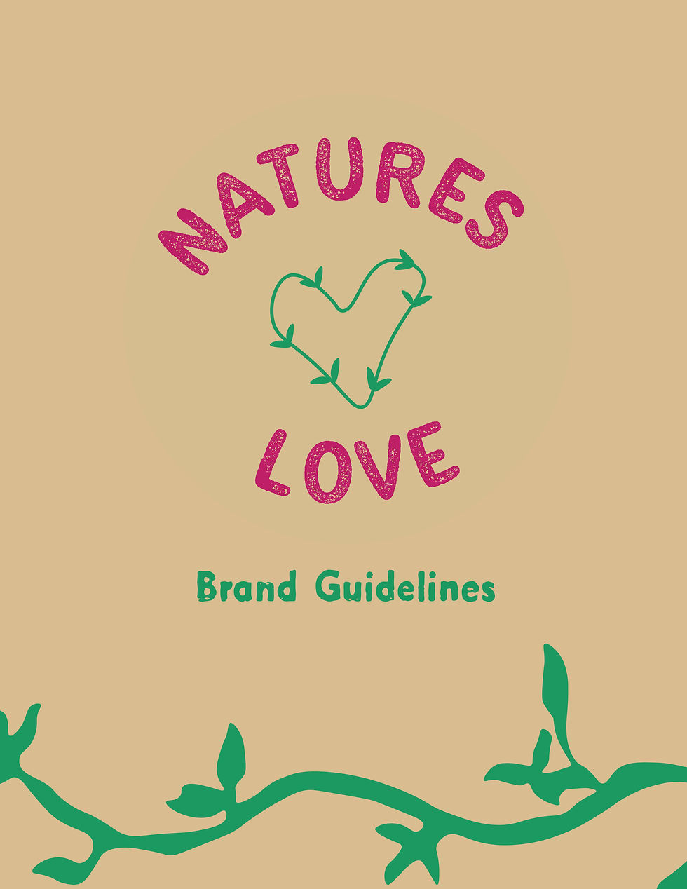
- Brande Guidelines
Brand Strategy

Brand personality:
Earthy, fresh, organic, and sweet.
Visual Identity
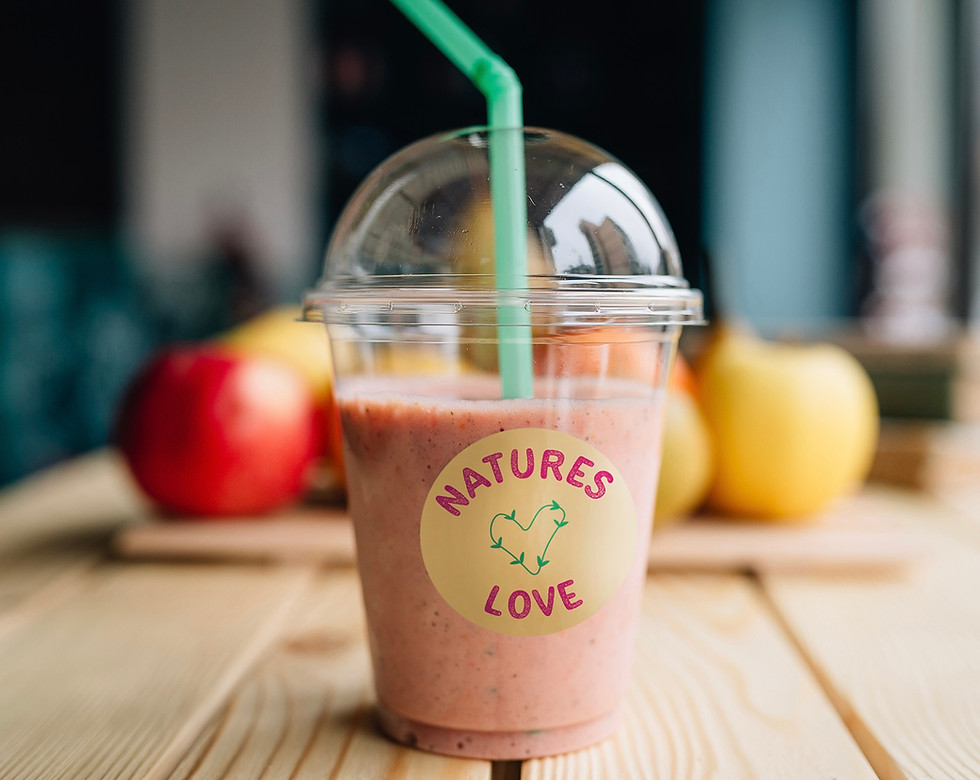
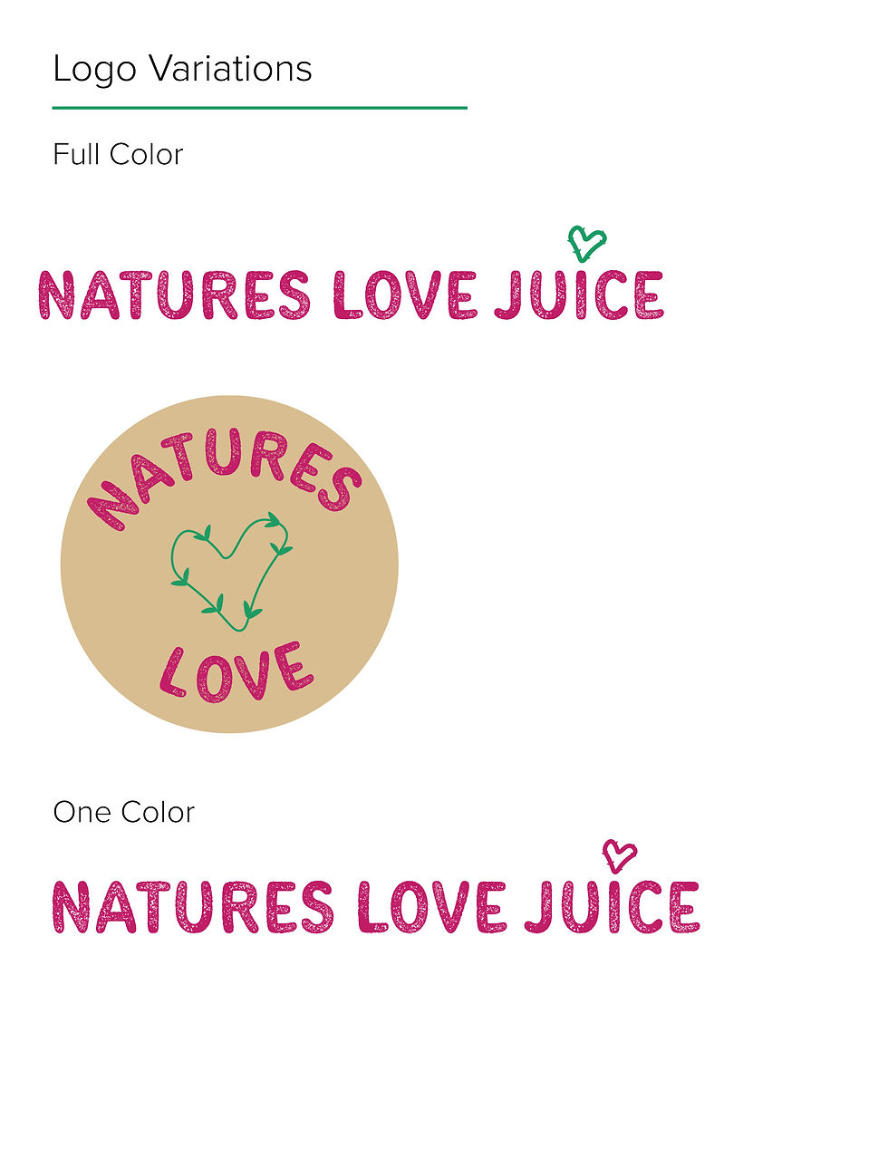
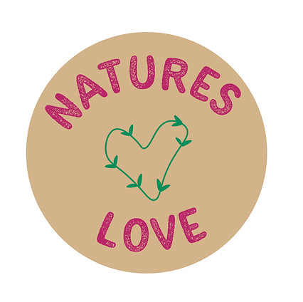
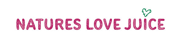
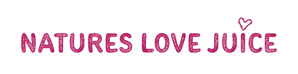
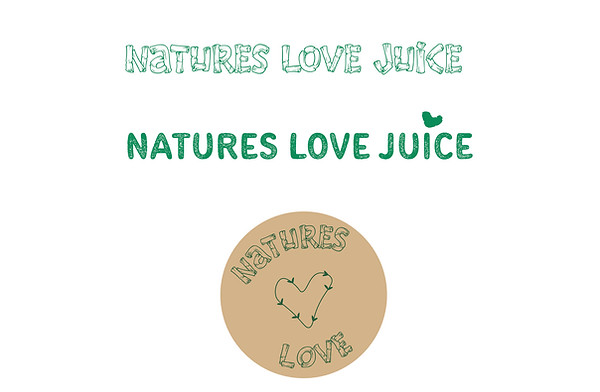
The logo
When redesigning the logo and the rest of the brand elements, I narrowed it down to three colors: green, pink, and beige. Green and beige are natural and earthy, while the pink adds a pop of color the way a fruit (blended into your smoothie) does on a tree or bush. In addition to the color, the textured typeface and plant illustration motifs play a huge role in the earthy vibes.
First logo concept
Primary Typeface:
Secondary Typeface:

Color Palette:

#c11e68

#1e9b63

#d8bd91
Applications