Spindle
Project Overview
Showing a classic way to listen to music in a new modern manner.
Most people get out their headphones when they want to listen to their favorite songs, but there are other ways to listen. When you think of a record player, a nice jazz tune or funky hit from the 70's probably comes to mind, but they're still used everyday by different people. In recent years, there has been a resurgence of admiration for vinyl records. Spindle was created to give everyone, no matter the genre, a chance to hear their songs on a record player, and we helped them to create a brand that appealed to all genre listeners of today.
Brand name: Spindle
Objective:Create a brand that makes vinyl records appeal to the young adults of today, regardless of what genre they are into.


What we did
- Name
- Logo
- Color Palette
- Typography
- App Design
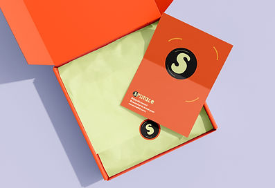
- Packaging
- Brande Guidelines
Brand Strategy
Brand personality: Loud but inviting, like a person reaching out their hand to bring you on the dance floor
Naming:Named after the central post on the platter of a record player that holds a vinyl record in place, which is called a spindle.

Visual Identity
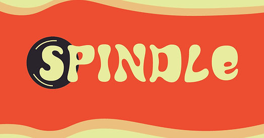
The Logo

The core of the logo is the letter S, which not only stands for the word Spindle, but gives a spinning motion as well. This is essential to the fact that the black circle behind it is to help resemble a vinyl record. We paired this with our groovy 70's vibes typeface and bright color palette to create a logo that represents what Spindle is about. After testing it with different colors, we decided the orange and yellow-green created the perfect use on dark and light backgrounds.

Color Palette: Our color choices were meant to avoid association with a specific genre of music, for example pink being associated with pop, blue with jazz, etc. Orange is generally a color that can be associated with multiple different genres, and therefore does not turn away any music listener from the brand.
Typeface:Named For a brand based on a tool associated with the 70's, we chose a typeface that is groovy and fun, making the logo and packaging attractive and a reminder of retro aesthetics.
Applications


Reflections
Worked well: The logo seems to work well and the overall identity is good. I feel it communicates the brands values well and accurately embodies a retro turned modern identity.
Given more time:There does need to be more examples of application, such as more mockups. There could also be improvement with the app, as it is a bit bland.
key takeaways:Take your time! The best parts of this project were the app, billboard, and logos, which I spent more time on compared to pieces like the flyer.